
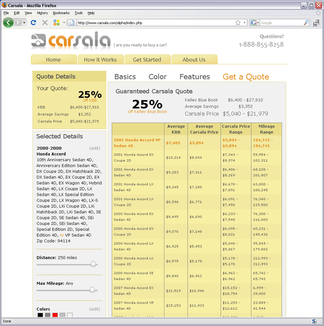
 The original configurator is where the user chooses the attributes of a car (color, mileage, location, etc.) that are acceptable to her. My diagnosis was (1) Three long pages of questions is too many, even if they're all important; (2) The payoff — the quote that appears after all questions have been asked — shows too much data in tiny type; (3) This tool seriously discourages the user from experimenting, because of the four-page pipeline that must be negotiated.
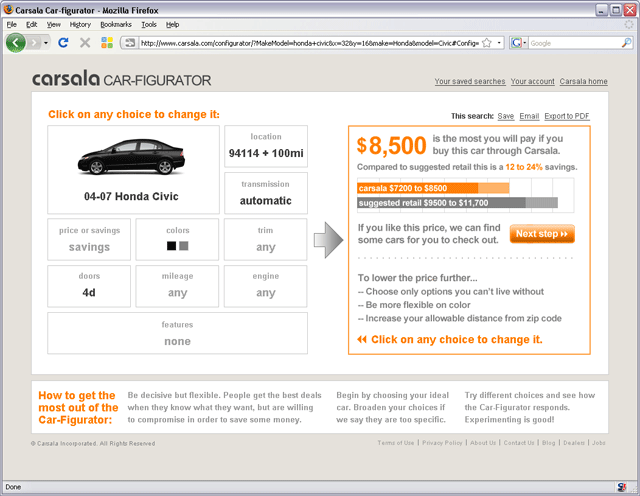 The redesigned configurator merges all four steps, including the quote, on one page with no scrolling and no crowding. Not only does the user answer only the questions that matter to her, she doesn't even see the others.
Experimentation is important and this UI makes it easy. A user may have to give up a prized option or be less choosy about color in order to get the desired price. After the redesign, users spent a lot more time in the configurator and more users made it to the next stage of requesting a negotiator to locate the car.
I put the name "Car-figurator" on one of the early mockups and it stuck.
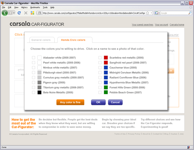 Changing a choice is easy: Click on it, and a popup appears. Make a choice, click "OK," and the impact of your choice is instantly displayed.
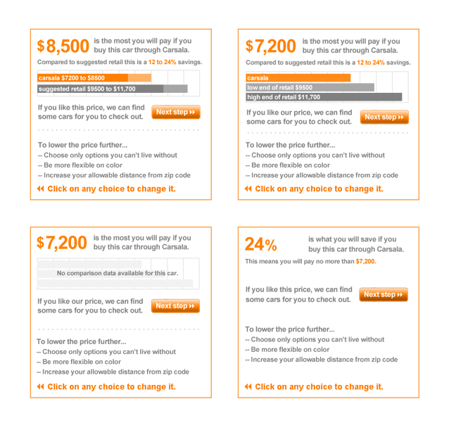 Many reactions are possible on the right side of the UI — these are a few. The user may be too specific or not specific enough. There may be certain information missing from the Carsala database. The user may wish to see "savings" rather than price.
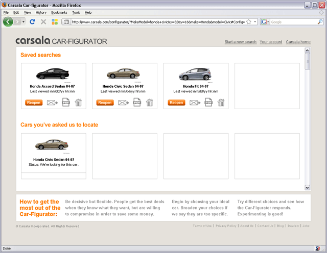 The user can save searches and track requests on this page. It's tempting to make this a "database dump" page — throw up some rows and columns and call it a day. But for all its unglamorousness this is a key page for users, and I took the opportunity to use the photo of the car to make it less dry. Given the purpose of the site, we judged that no one would be shopping for more than four cars at once, although in that unlikely event, a second row can appear.
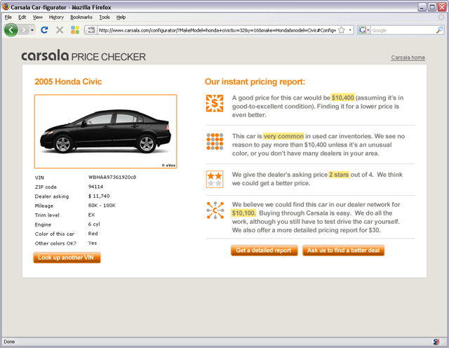 Another tool with a similar UI, the Price Checker allows a user to type in the VIN of an automobile he is interested in buying. The Carsala system evaluates the asking price against the price Carsala negotiators could likely obtain.
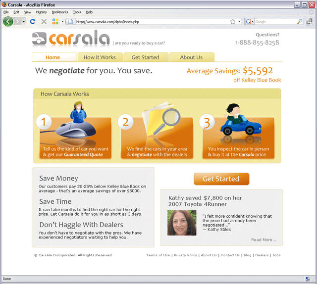 Original home page design. Before users use the Car-figurator we have to explain the service and entice them to try it. On this home page, the founders did a lot of things right. They used the time-honored "1-2-3" steps to summarize the service. They are clear about the value proposition. They include a testimonial with a photo on the home page. But they were concerned that they were not projecting a sufficiently professional image as they tried to persuade users to part with thousands of dollars on a Carsala-located car.
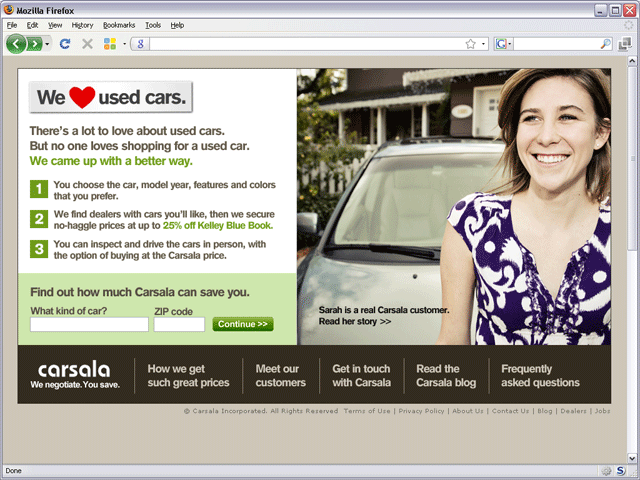 Redesigned home page. I wanted to begin with a provocative statement to get the user thinking, which turned out to be "We love used cars." That statement led into the assertion "No one likes shopping for a used car," which almost anyone would agree with. The bumper sticker at the top needed breathing room, so we put the Carsala logo and navigation at the bottom. The content area of the page has a locked-in height, so this placement of the nav is not a problem.
This page projects a calmer image with more sophisticated colors and takes the user's eye around the page in a more considered way. Instead of an opaque "Get started" button, I designed it to better entice users to try out the locator tool. The Carsala founders asked a professional photographer friend to shoot photos of actual customers who love their cars, which was a wonderful resource for me to draw upon.