Enron.com redesign #1
In a previous life, as they say, I was the creative director for Enron's internal web agency.
A couple of years in, I launched
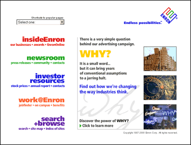
a site-wide redesign that radically simplified the site, removing extraneous content and streamlining
the enron.com home page. At the times, dense, newspaper-like home pages were the rule among the rest
of the Fortune 500. I was happy to have the support of senior management to be different and innovative.
After talking with customers of every business unit
I proposed a very simple information design: five major links,
a handful of frequently sought pages in a menu box and a single
"umbrella" message to encompass the company's many activities.
This new design was a smashing success. It ended the internal battles over
real estate on the home page and we received an avalanche of compliments from customers on how
easy it was to navigate. This design was supplanted a few years later by
another redesign.
 Home page |
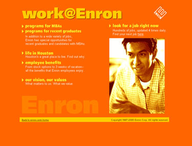
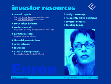
 Level 2 page |
|
 Level 2 page |
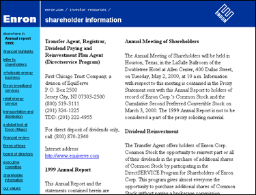
 Level 3 page, color-keyed to its Level 2 page |
|
Even though a copyright notice is not required, here it is: Copyright © 2010 Leo Rigney.