
Inkchaser
Inkchaser is a San Francisco-based commercial printer, booking all of its sales through its web site.
The CEO engaged me to rethink the user interface for their
extensive and sophisticated price quote system. A short time into the project he asked me to come up with a new look for the rest of the site as well.
This project is emblematic of what I most like to do:
Making very high information density easy to read and deal with;
making a complicated task approachable;
and making a site look polished without too many embellishments.
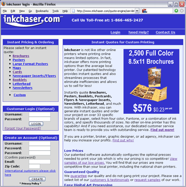 Original home page design. Significant page real estate devoted to logging in and registering leaves users with the impression that they must register to get a quote, which they do not. Navigation to level 2 pages is embedded in long stretches of copy. |
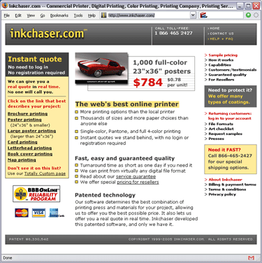 New home page. Most important links are enclosed in an eye-catching box at upper left; rotating banner ad is top center, followed by short & readable bullet points; exhaustive links to all information the user will need are provided at right, intercut with smaller promos to keep it interesting. |
|
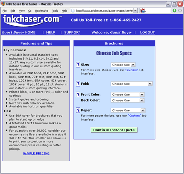 Page 1 of get-a-quote task: original design. |
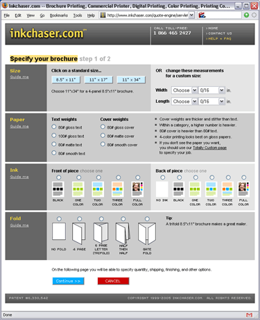 Redesign: standard paper sizes are provided as shortcuts; ink and fold choices are illustrated with small images; explanatory copy is grouped with each choice; progress ("step 1 of 2") is made clear. |
|
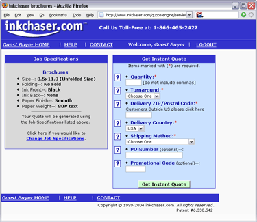 Page 2 of get-a-quote task: original design. |
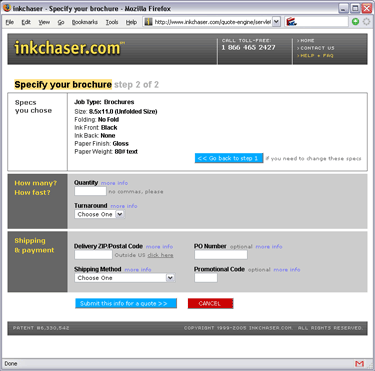 Redesign: white box shows choices already made; blue buttons show next possible actions, either to go forward or back in the process; a red cancel button is an explicit way to bail out of the quoting task. |
|
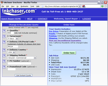 Page 3 of get-a-quote task: original design. |
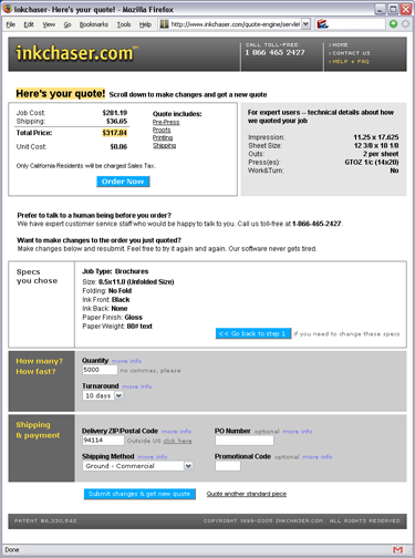 Redesign: "Here's your quote" reinforces the purpose of this page; all next steps are well labeled, including "order now," talk to a customer support rep, or make changes to any choice previously made. |
|
Even though a copyright notice is not required, here it is: Copyright © 2010 Leo Rigney.