Local Dirt
LocalDirt has created a marketplace for consumers and businesses (such as restaurants) to buy local food -- food grown as close by as possible, which not only saves fuel costs but lets the food arrive in far better condition.
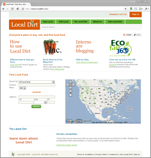
 Original home page. The founder and development team have packed a fair amount of information on this page, and they encourage users to play with their food location tool. However, I noticed there was no one-sentence explanation of what the company does. As well, I believed that the map distracted from the rest of the page, and in its initial state, before the user has initiated a search, where it shows the entire U.S., it is not conveying any information. I also felt that more important information should be higher on the page, and that a consciously designed path for the user's eye to follow was missing.
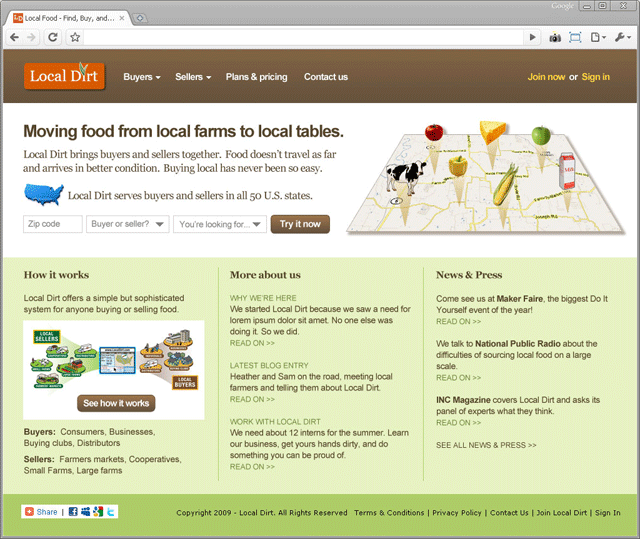
 Redesigned home page.
I used a tried-and-true layout, one column over three columns, with header and footer ribbons, to communicate to a web site visitor the relative importance of information on the page. The message area succinctly conveys the purpose of the company and the value proposition. The large map image, while supporting the message, cannot do so on its own — exceedingly few images can. Instead I intended it to to break up the space, give the eye a place to rest, and prevent the home page from being a sea of words. The form encourages the user to try out the service, and I specified that a visitor casually trying out the form should never see "No results found." In the remainder of the page I expose all the parts of the web site to let the user know what else there is to learn, and to help repeat visitors find their way quickly to what they seek.
Even though a copyright notice is not required, here it is: Copyright © 2010 Leo Rigney.