
Doppelganger
Doppelganger's one product is vSide, a true-3D virtual world for teens. Music plays at all times in the streets and clubs. Players can hang out in public areas or privately owned apartments. An apartment owner can buy and arrange art and furniture, host parties, and play music or YouTube videos of their choice. Players can choose from thousands of hairstyles, clothing, and accessories -- most designed by staff artists, some by other players. I did all my user research in-world. Once I identified myself to users as the UI guy, they avalanched me with ideas and complaints about gameplay mechanics and the user interface, which made my job that much easier.
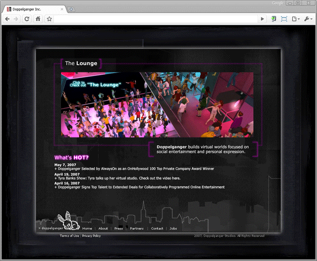 Original home page. The original name of vSide was "The Music Lounge," later "the Lounge," then vSide. I was struck by how this page was doing double duty as a product home page and a corporate home page, and that it wasn't clear how a new user would proceed.
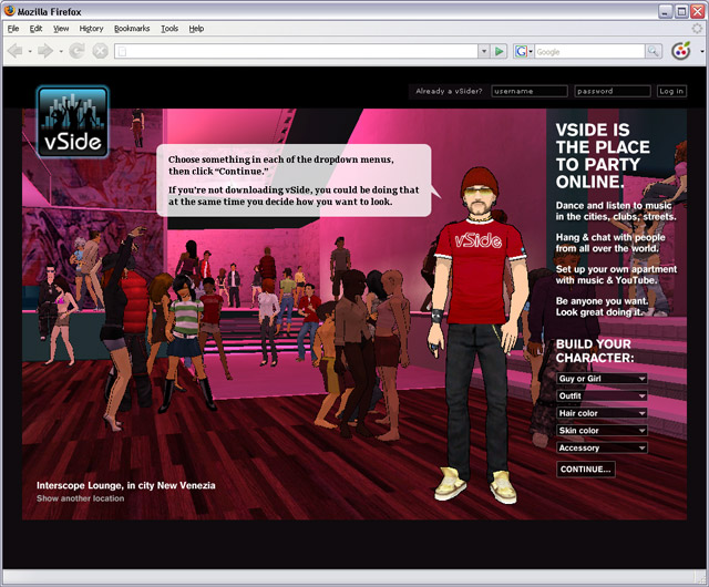 Redesigned home page.
I chose a senior player, wearing a vSide-branded t-shirt and clothes that only experienced players could buy, to be the spokesman on this page. He gives you hints during the signup process of what you can do next. On the right, a short explanation covers the value proposition and leads the user into the first step of signing up, which is not filling out a username and password blank, but instead is something fun: Start dressing your avatar. I went to the same club depicted in the original home page design and shot new photos at eye level which is more engaging than a bird's-eye view. The user can see other places in vSide using a link at the lower left. User enrollment jumped by 10x when this design was rolled out.
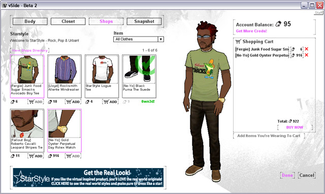 Original clothes shopping UI.
Within vSide there are about 20 distinct stores, each carrying 50-100 items of clothing, jewelry, sunglasses, shoes, and handheld items. Some of the stores are associated with real-world brands such as Kitson and RocaWear. Some of the clothing items are branded with celebrity endorsements such as Ne-Yo and Fergie. The client wanted to add strong store branding, longer item descriptions, and the ability to buy with a second currency type, all to a fairly cluttered interface. The client did not want to change the whole interface -- right at that time, anyway -- to match the black branding we had adopted both inside and outside the product.
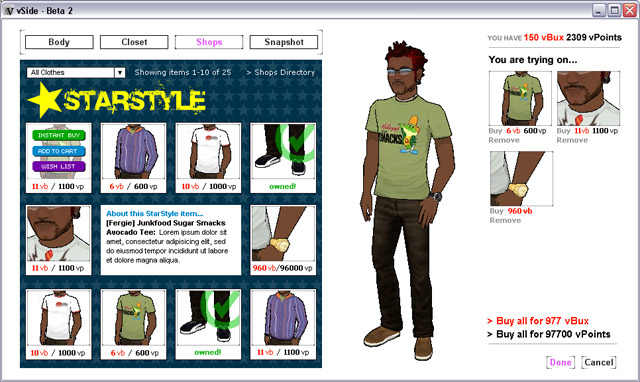 Redesigned clothes shopping UI.
The client had used a shopping-cart metaphor, with room to buy 20 items at a time, but in doing in-world interviews I discovered that 95% of the time players had money to buy only one coveted item. So I argued that each item should be instant-buy, with no cart. Because the player is allowed to try on several items at once without buying, I used the space previously occupied by the shopping cart to list what's being tried on. I achieved the client's goals of strong branding, longer item descriptions, and accommodation of a second currency type while making the UI a little more clear.
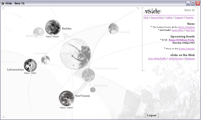 Original entry portal.
After a member user logs in, he is asked to choose to which city he wants to teleport. This UI, while attractive and possibly edgy, was low on information and didn't make it clear that the primary purpose of this screen is to choose a city. At this point the client and I had been working together for some time and they gave me a lot of latitude in the redesign.
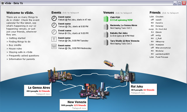 Redesigned entry portal.
Adding photos of the cities and the subway systems between them, I made it clearer what this page was about. I offered more information about current and upcoming events, which of the user's friends are logged in, which are idle, and where they are. The floating blimp can be seen from all the cities, so placing it on this UI added a further bit of context.
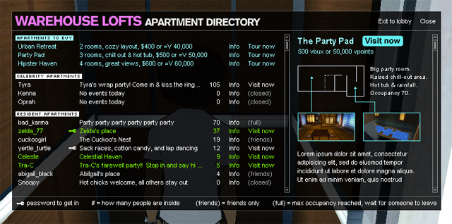 Redesigned building directory.
Users can purchase apartments in a choice of buildings. When a user enters a building lobby she can see who lives there, or tour model apartments, or visit celebrity apartments if parties are taking place there. I packed a great deal of information in a small space while keeping it clear. This was an entirely new UI, with no original form.
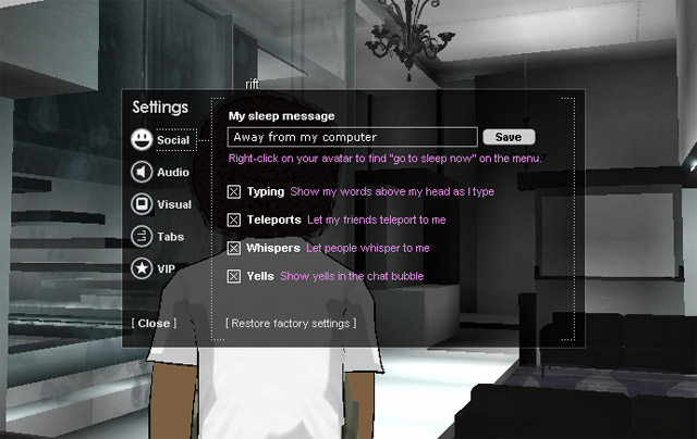 Redesigned settings UI.
Another UI that I failed to capture in its original form, this UI allows a player to customize his experience. I kept the client's visual vocabulary of dotted lines, brackets, and colors, while adding explanations of the (sometimes opaque) settings.
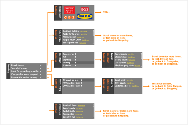 Transition diagram of furniture shopping UI.
Once users own an apartment they can shop for furniture. The client had allocated a tiny spot for this UI, so I had to get creative. Stealing liberally from the iPod interface I found a way to get a large hierarchy into a small space without undue user frustration -- and in the process managed to show them a UI that most of them already understood.
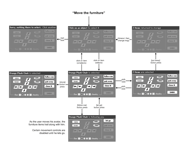 Transition diagram of furniture mover UI.
Users can move furniture and other objects around their apartments using this UI. Again, the client had allocated a tiny spot for this UI, so I had to be space-aware but also clear. This state transition diagram communicated the design to the developers.
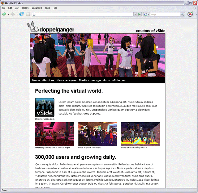 Redesigned corporate web site.
In anticipation of acquisition talks, the company needed a new, up-to-date corporate site and needed it fast. I wrote all new content, took photos with the help of users willing to pose for me, and designed the site. I kept it simple, clear, and informative, with just enough eye candy to reflect the company's mission, which is to entertain teens with a cutting-edge game.
Even though a copyright notice is not required, here it is: Copyright © 2010 Leo Rigney.