Wikia
Wikia provides a framework for communities to create their own wikis. Notable among these are Wookieepedia, the Star Wars wiki, Lostpedia, and Familypedia. Communities, particularly the non-tech, non-fandom wiki communities, wanted a clearer user interface and more control over the visual design of their wikis. Wikia hired me to figure it out. Here I use the example of Wookieepedia, the leading wiki in the galaxy of wikis hosted by Wikia.
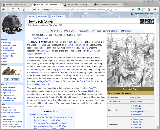
 Original design.
Article content dominates the page, as it should, but important tasks are stacked up in small type at the left margin without effective grouping or ordering. The most critical tasks are in tiny tabs at the top of the page, easily missed.The light blue color of the page background tends to bleed into the article, particularly the blue links in the article, blurring the line between the article content and the meta-article content.
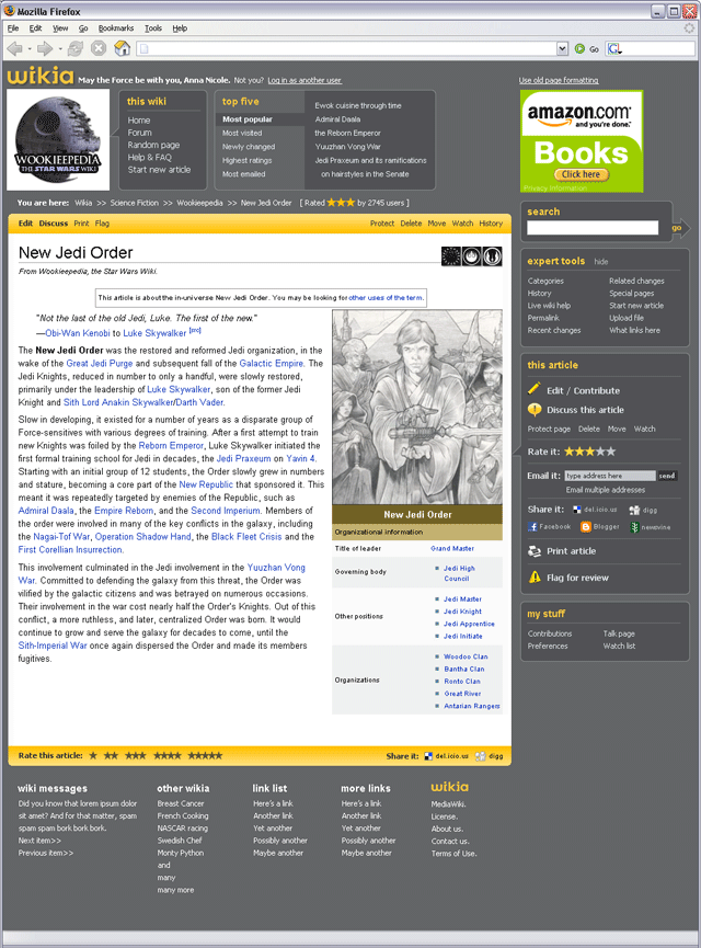
 Redesign.
The client's major goals were (1) to highlight that these articles have lots of participatory functions attached to them -- editing, discussing, and so on; (2) to add even more functions such as expert tools, rating, sharing, top 10 lists, bread crumbs, and more; (3) to add space for advertising; (4) to add the Wikia logo to the page without unduly disturbing the community; (5) to update the look. I think we accomplished all of these goals. I created compartments to group related functions, which allowed me to add functions without creating overly long lists. The compartments allow the client to continue adding links and tools after I'm gone. The scheme of white article plus dark infrastructure allows the user to focus on the content when he wants to, and on the tools and meta-content when he wants to. I specified additional content that could appear at the top of the page depending upon the user's window size.
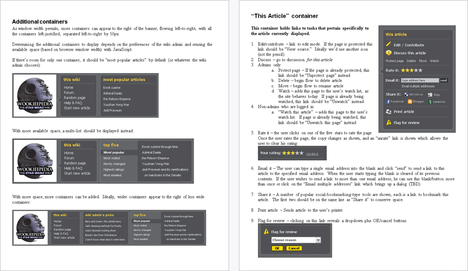
I wrote a behavior spec for the client's developers. Two pages are excerpted below.

Even though a copyright notice is not required, here it is: Copyright © 2010 Leo Rigney.